03 October 2011
Mapping Wikileaks Afghan War Diary Data Using Google Fusion Tables (Part 2 of 2)
This tutorial demonstrates how to import, map, and visualize a Wikileaks dataset using Google Fusion Tables. It also serves as a general introduction to the use and visualization of datasets via Google Fusion Tables, which is a powerful web application for managing, editing, and publishing visual representations of one’s data (geospatial and otherwise) on the web.
In completing this tutorial, you will be able to create, edit, and import an interactive Google map much like those used by major news outlets, e.g. see here for an example from The Guardian.
Note: This is part 2 of a 2-part tutorial. Part 1 demonstrated how to download, decompress, parse, and clean Wikileaks data. Part 2 focuses on visualizing that data. You needn’t complete part 1 to complete part 2.
Steps
-
Import the Data into Google Fusion Tables
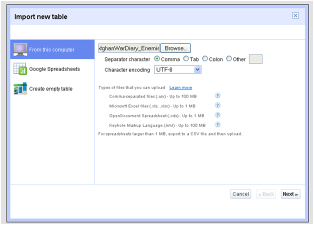
Import your .csv file to Google Fusion Tables First, you’ll need to have a Google account to complete this tutorial. Google accounts are free. Sign in or sign up.
If you didn’t create it yourself in Part 1, the dataset for this tutorial (~2 MB) can be downloaded here: /i/2011/08/AfghanWarDiary_EnemiesDetained.csv.
Go ahead and download this .csv file now (note: a .csv file can be accessed using Excel, but we should have no need of that program).
After downloading the dataset, go to http://www.google.com/fusiontables. Sign in if you haven’t already, then select the “Import Table” option in the “New Table” drop down menu at the top left of the page. From there, browse to find the .csv file you just downloaded. Make sure “Comma” is selected as the “Separator character” and the “Character Encoding” is “UTF-8.” Click “next”.
Importing may take a minute or so, depending on the speed of your connection. After the information is uploaded, an import dialog will start and automatically select the first row as the row for determining column names. Just click “next” here (the .csv file is set up so that the columns’ titles are listed in the first row), and then click “finish” on the last page, unless you want to change the name of the document or provide more documentation.
-
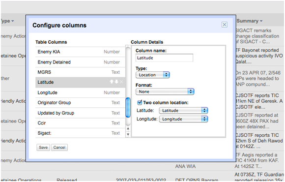
Click “Save”. Now that you’ve Geocoded the data and modified your columns, your Fusion Table is ready to visualize! Format the data in Google Fusion Tables
Once your information is imported, you’ll need to format it so it will be ready for mapping.
In the File menu, select the “Geocode” option. This will automatically select the “Latitude” column, so just click the Geocode button. Once the bar hits 100%, you can close this dialog.
You’ll also want to modify the columns so that Google is recognizing each column for what it is. You can do this by selecting the “Modify columns” option in the Edit menu. Google gives you four options for each column: text, number, location, and date/time. Make sure the columns in your able are correctly labeled (you might need to change the Type of the “tracking number” to “text”). The latitude column should be labeled location and the box next to “Two column location:” should be checked. This should happen automatically, but if you want to check, your dialog should look like the image you see to the right.
Click “Save”. Now that you’ve Geocoded the data and modified your columns, your Fusion Table is ready to visualize!
-
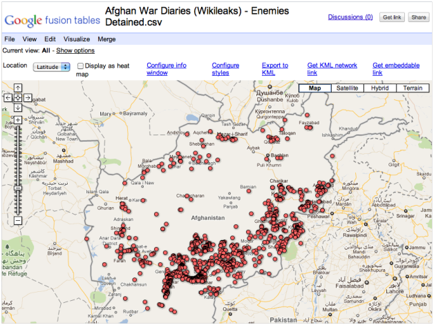
First view of our map with default markers. Next we’ll customize! Map the data
Select the “Map” option from the Visualize menu at the top of your spreadsheet.
This should automatically drop you into a Google map centered on your data points (in our case, Afghanistan). The markers may not immediately appear when you first view your map in Google Fusion Tables. If you don't see the map markers, zoom in or out and they will appear.
-
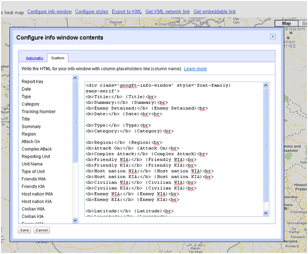
Here's an example of my (simple) html layout. Visualize the data - Customize the Pop-Up Windows
Our dataset provides much more than a list of coordinates, so we’ll want to figure out how to display additional information via the pop-up windows and markers. In this step we will customize the pop-up windows.
Google will automatically select certain fields to appear in the windows that pop up if you click on a marker. To configure this yourself, go to the “Configure info window” link at the top. Here, you can click on the columns you’d like displayed and delete those you don’t want displayed– for our purposes we definitely want to add the “Enemies Detained” column to the list of columns to be included.
After choosing the columns you want displayed, use the custom tab to order and format the columns any way you like. If you are unfamiliar with html, I would suggest simply arranging the rows in the order you’d like them to be listed (see my simple example). If you do know html, this is a really powerful tool and can be used to add links, images, etc.
-
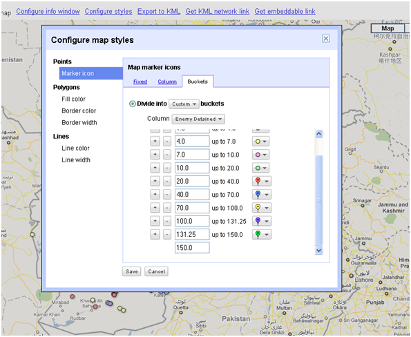
Here’s an example of how my customizations look (note the first two buckets are not shown). I use smaller divisions towards the low end of the amount of detainees and larger ones towards the top of the range. Visualize the data - Customize the Markers
Although your map will now mark the relevant locations and display the information you want to display in the pop-up windows, all the markers will look the same and give no hint as to which markers mark locations where greater numbers of detainees were taken into custody.
To highlight this information, you’ll need to select the “Configure styles” option above the map. Here you can customize your marker icons by how many detainees were taken.
Since we are only dealing with points on the map, you’ll want to adjust the settings for the “Marker icon” (the default selection). Once you’re on that option, select the “Buckets” tab to the right, then divide the markers into 8 buckets and change the final number to 150.
This will divide the markers equally, and assign smaller colored markers to the lower numbers and larger markers to the higher numbers. You can customize the way these numbers are divided as well (see my example below), but you’ll see changes even if you don’t customize them.
Once you’ve determined your buckets, click save. The markers will now not only show where detainees were picked up, but also indicate how many detainees were picked up in those locations.
-

If you’d like to embed a larger or smaller version of the map, simply change the “width” and “height” attributes in the iframe embeddable code to the size you desire. Share/Embed the Map
After you’re finished, you’ll want to share your map. You can do so by clicking the “Share” button at the top right, which will let you send an email to friends or colleagues.
You can also click the “Get link” button to obtain a link to send or publish – if you do send the link, you’ll want to change the settings for the map from “Private” to either “Public” or “Unlisted” via the same “Share” button mentioned above, so that other users are allowed to view your map.
Here’s a link to the map I created following this process: http://www.google.com/fusiontables/DataSource?snapid=S197759ENg-&pli=1
If you’d like to embed the map onto your own website, you can select the “Get embeddable link” option just above the map. This will provide you with code that you can embed within a website, blog, or other online resource. If you’d like the map to appear bigger, you just need to change the width and height options at the beginning of the code.
Finally, if you’d like to view your map in Google Earth or in a GIS program you can “Export to KML” or “Get EML network link.” The KML file can be viewed by opening it with Google Earth.
Learn More
Congrats! You've created an interactive visualization using Wikileaks information. The process you've learned here is applicable not only to this content, but to any tabular dataset with a geospatial component.

